Logo Designs
I like to design logos that are highly illustrative and overall fun to look at. Most of my logos are drawn by hand and the vectorize to keep its cartoony appeal.
SWIFT SWEET LOGO
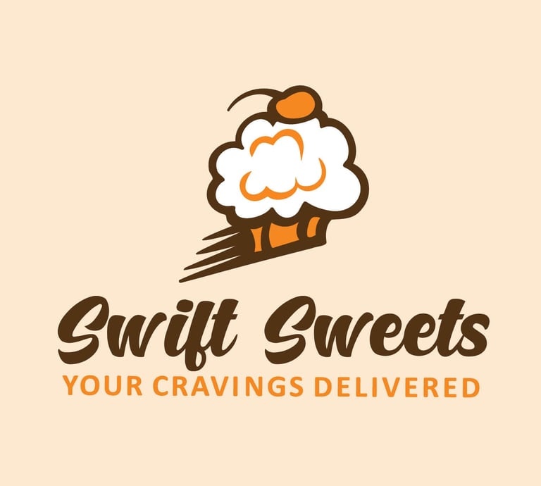
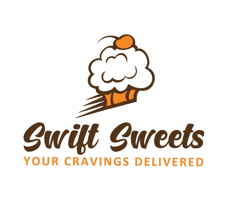
Swift Sweets is a delightful delivery business dedicated to satisfying your dessert cravings.
Born as a college project, my vision was to develop a company that embodies the perfect blend of sweetness and speed. Whether you have a special occasion to celebrate or simply need a sweet pick-me-up, Swift Sweets is here to make your dessert dreams a reality.
For this hand drawn logo I used a cupcake as a dual representation of both sweetness and desserts. I used the color orange to differ from the regular food colors such as red and yellow and to give it an energetic feel which also plays into the "Swift" in "Swift Sweets."
MIMOSA WEEKEND TAKEOVER LOGO
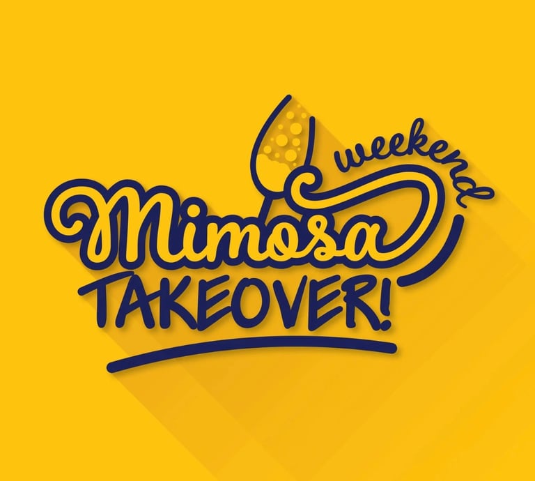
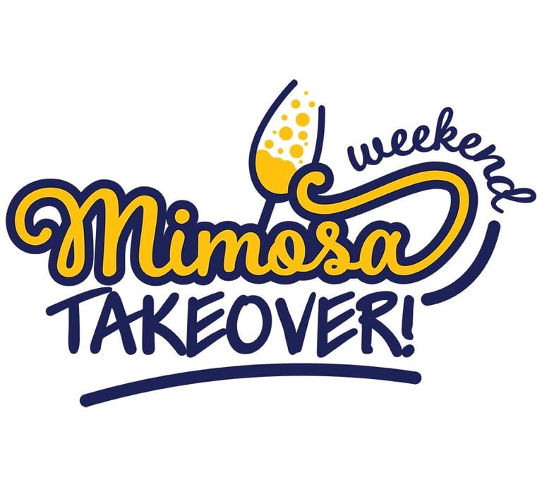
The Mimosa Takeover logo was designed to be bold, urban, and fun, capturing the energetic spirit of the brand.
With a focus on easy versatility, the logo stands out with its strong, eye-catching colors. The vibrant yellow evokes the refreshing essence of mimosas, instantly drawing attention, while the contrasting blue provides a dynamic "punch" that adds balance and depth to the design. It’s a logo that’s both playful and professional, making it perfect for any setting while leaving a lasting impression.
BIG BITES LOGO
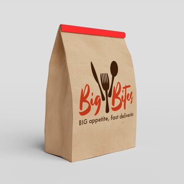
This logo represents the fusion of high-end appeal with a personal touch, emphasizing Big Bites' commitment to delivering quality products to a diverse
customer base.
Big Bites, a subsidiary of Swift Sweets, shares the same purpose as its parent company but caters to a wider audience–not just desserts. The logo for Big Bites was designed with the idea of creating a sophisticated and modern brand image. To achieve this, elegant and handwritten fonts were carefully chosen, giving the logo a personal touch. Additionally, utensil was incorporated into the design to reconnect it with its original concept and purpose.
PESCE LOGO
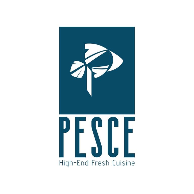
This hipster brand was in need of a new and contemporary appearance to promote their seafood restaurant.
Similar to the previous logos, Pesce was also born from a college project. In order to create this design, I needed to create a brand and feel of the company. To achieve this, I decided to transform the letter "p" in the word "pesce" into a fish symbol, emphasizing their specialty. This fish emblem was incorporated into the design, aligning with the brand's modernistic appeal. The fresh and modern look of the emblem perfectly captures the essence of the seafood restaurant, attracting the attention of potential customers. With this new visual identity, the hipster brand showcases its unique style and stands out from its competitors in the market.
Branding
Branding plays a crucial role in the overall design of a company. It serves to strengthen and professionalize the brand, while also enabling effective promotion.
CMHA 2023 MID-YEAR MEETING
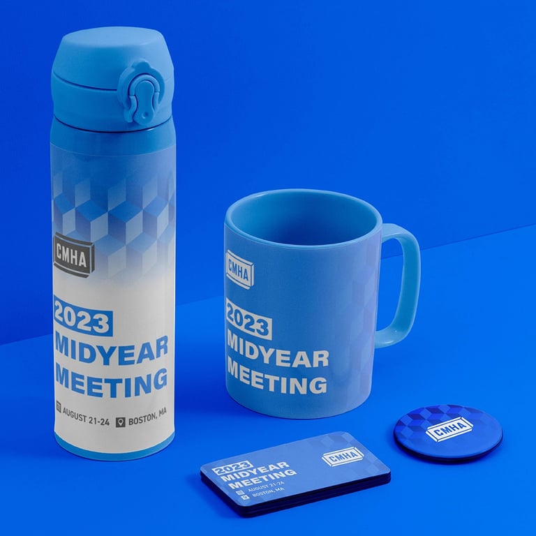
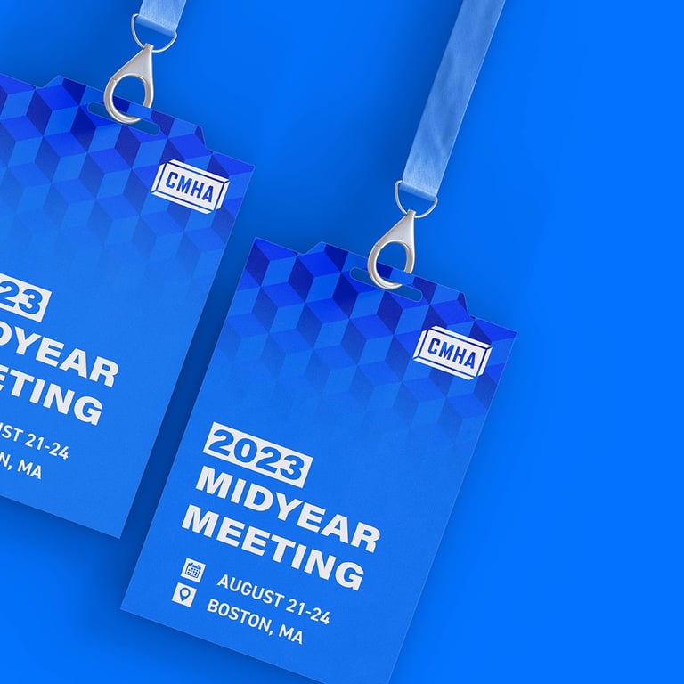
The Concrete Masonry & Hardscape Association is the authority for segmental concrete products and systems.
Though the original logo was not designed by me, I assisted in creating the branding for the annual mid-year meeting. For events like these, it's important that the branding is strong and cohesive all around. Equally important is for it to be appealing to the client, so that it can promote the event whilst also serving its original purpose.
SWIFT SWEET BRANDING
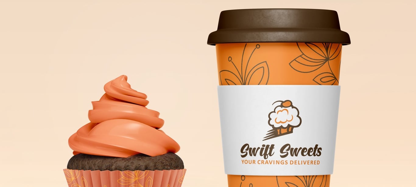
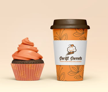
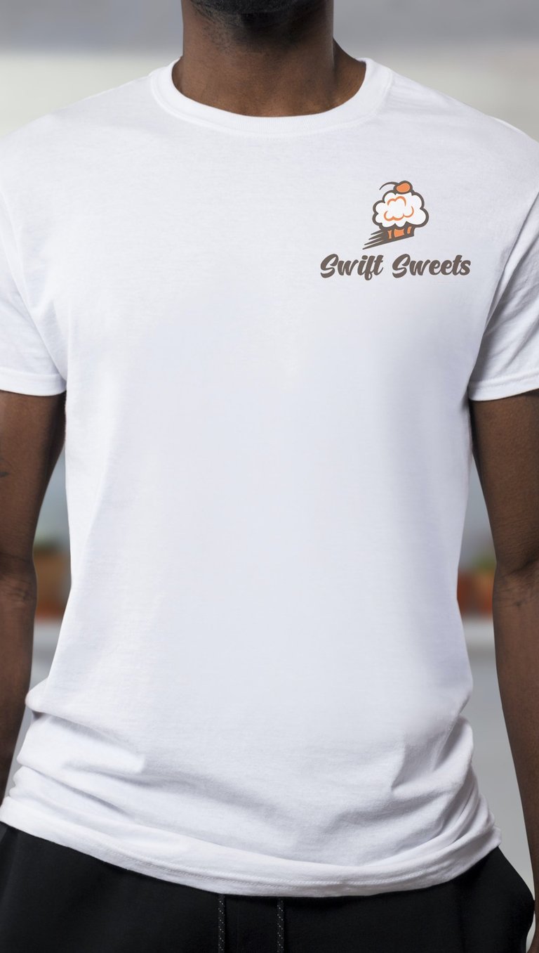
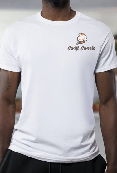
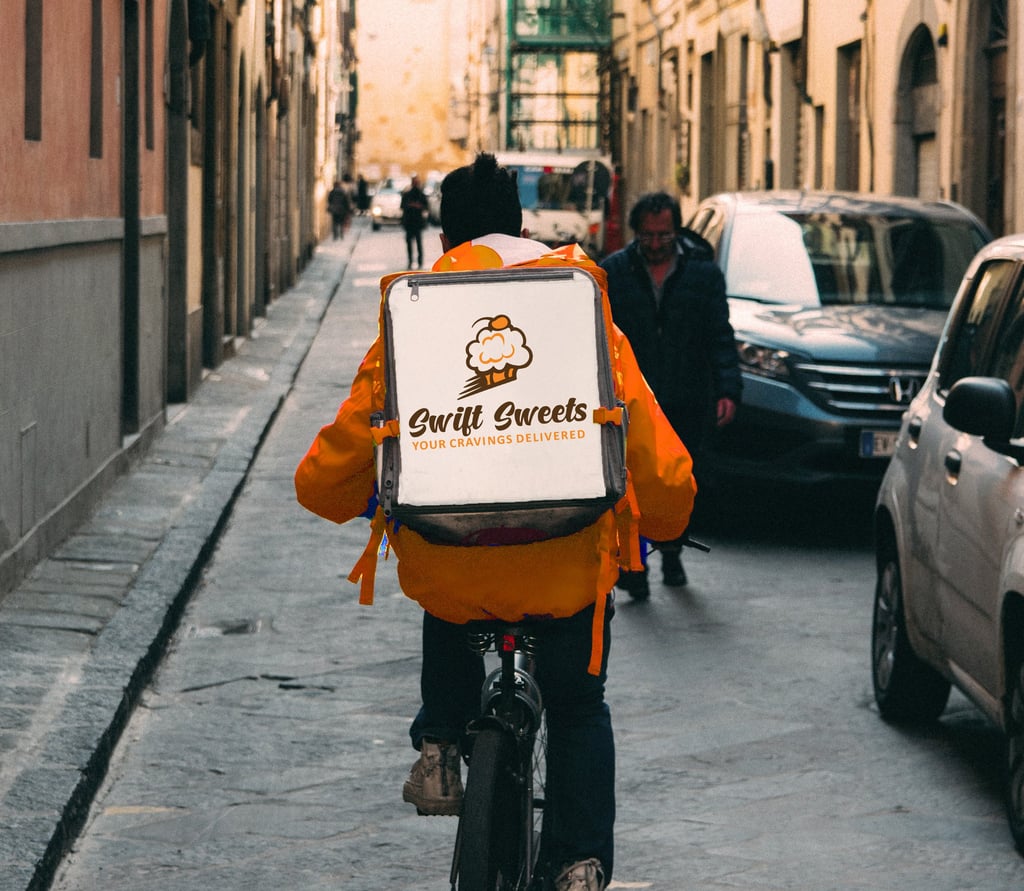
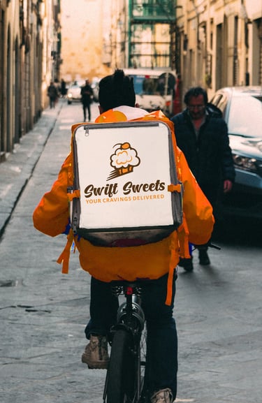
Orange! Orange! Orange!
Since the logo design was primarily driven by the concept of energy, it was vital that all brand contained the color symbolic of that. It was crucial to incorporate the image of a cupcake into the brand as well since it was equally important to convey the sweetness and softness associated with desserts.
PESCE BRANDING
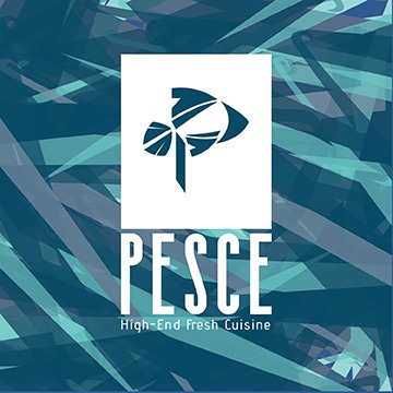
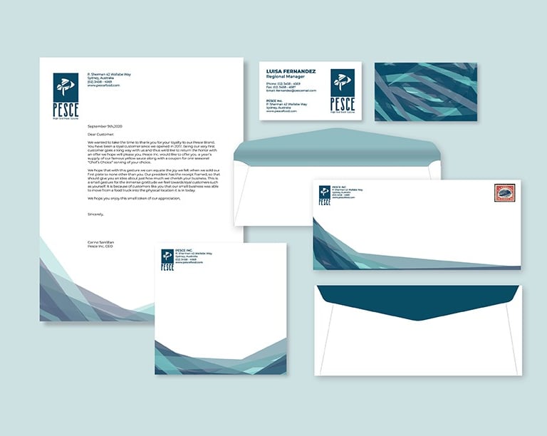
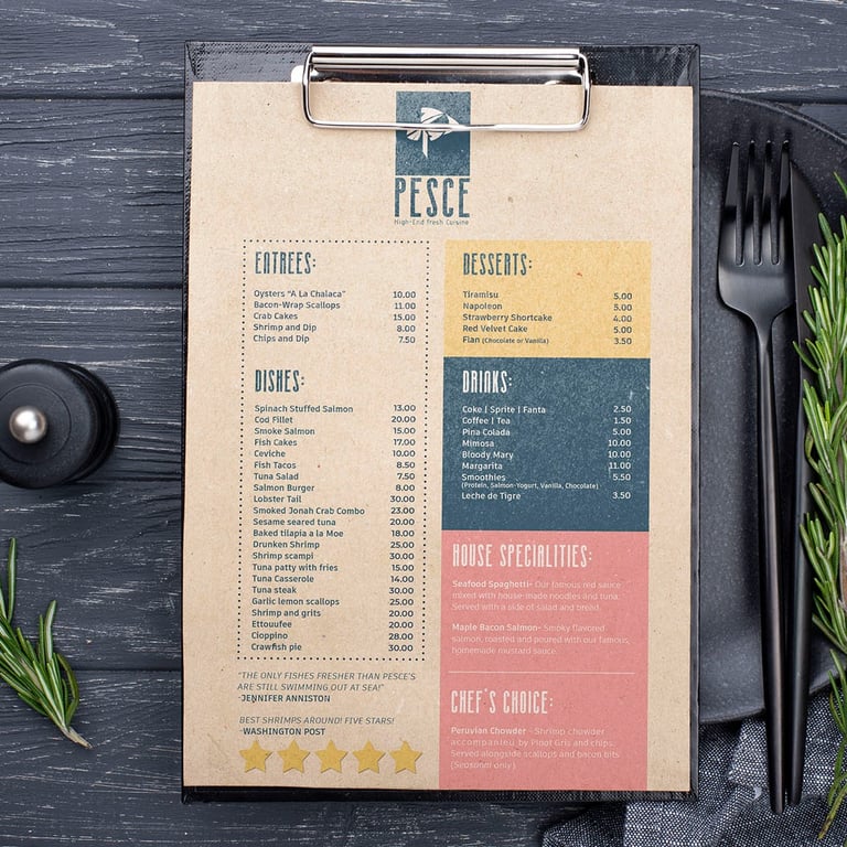
This hipster brand was in need of a rejuvenated and contemporary appearance.
To achieve this, I decided to focus on cool colors and incorporate an abstract pattern inspired by the ocean. The combination of these elements created a fresh and modern look that perfectly captured the essence of the brand. The cool colors added a sense of tranquility and uniqueness, while the abstract pattern evoked a sense of mystery and depth, just like the vastness of the ocean. Overall, the new design successfully portrayed the brand's hipster aesthetic while also giving it a trendy and timeless appeal.
BIG BITES BRANDING
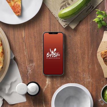
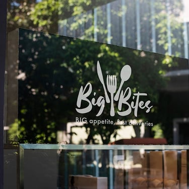
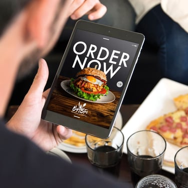
This brand needed to have similar branding to Swift Sweets while still maintaining its sovereignty.
I wanted to make sure the brand was professional, but also could make the client hungry enough to order when looking at it. The aesthetic was industrial, but wanted to make sure it still kept its modern style.
